
Introduction Self-Organizing Maps (SOM)
Self-Organizing Maps first introduce by Teuvo Kohonen. According to the Wiki, Self-Organizing Map (SOM) or self-organizing feature map (SOFM) is a type of artificial neural network (ANN) that is trained using unsupervised learning to produce a low-dimensional (typically two-dimensional), discretized representation of the input space of the training samples, called a map, and is therefore a method to do dimensionality reduction.1 SOM isan unsupervised data visualization technique that can be used to visualize high-dimensional data sets in lower (typically 2) dimensional representations.2 SOM also represent clustering concept by groupingsimilar features together. So, SOM can use to cluster high-dimensional data sets by doing dimensionality reduction and visualize it using maps.
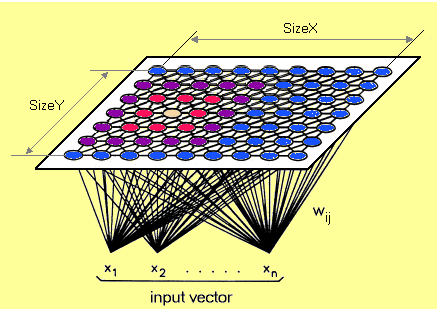
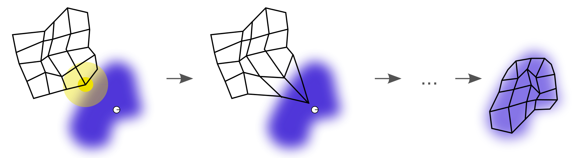
Each data point in the data set recognizes themselves by competing for representation. SOM mapping steps startfrom initializing the weight vectors. From there a sample vector is selected randomly and the map of weight vectors is searched to find which weight best represents that sample. Each weight vector has neighborhood weights that are close to it. The weight that is chosen is rewarded by being able to become more like that randomly selected sample vector. The neighbors of that weight are also rewarded by being able to become more like the chosen sample vector. This allows the map to grow and form different shapes. Most generally, they form square/rectangular/hexagonal/L shapes in the 2D feature space.
SOM calculatesthe distance of each input vector by each weight of nodes. The distance that usually used is Euclidean distance.
This how SOM algorithm work :3
- Preparing input data for training data sets.
- Each node’s weights are initialized. A vector is chosen at random from the set of training data.
- Calculate the distance of each node. The winning node is commonly known as theBest Matching Unit (BMU).
- Updating of weight, then calculate again which one’s weights are most like the input vectors.
- Every BMU has a neighbor then calculated. The amount of neighbor is decreasedover time.
- The winning weight is rewarded with becoming more like the sample vector. The neighbors also become more like the sample vector. The closer a node is to the BMU, the more its weights get altered and the farther away the neighbor is from the BMU, the less it learns.
- Repeat the 2-5 step until every node getting close to input vectors.
There are a lot of use case that implement SOM algorithm :4
- Customer segmentation
- Fantasy league analysis
- Cyber profilling criminals
- Identifying crime
- etc.
SOM Analysis
In this article, we want to use web analytics dataset in San Francisco. We want to learn how to use SOM to identify characteristics of each cluster in many webs on San Francisco by some features.
Library Used
In this article, we used kohonen package for making a SOM algorithm. Since we know that kohonen packages are from class, we use it to make many key function such as :
somgrid(): initialized SOM node-setsom(): making a SOM model, change the radius of neighbourhood, learning rate, and iterationplot.kohonen()/plot(): visualization of resulting SOM
library(kohonen)
library(dplyr)
In this article, we want to use ads data from xyz company that makes ads on Facebook.
Data Pre-Processing
First of all we want to import the data in this workspace.
ads <- read.csv("data_input/KAG_conversion_data.csv") %>%
  glimpse()
#> Observations: 1,143
#> Variables: 11
#> $ ad_id               <int> 708746, 708749, 708771, 708815, 708818, 708820,...
#> $ xyz_campaign_id     <int> 916, 916, 916, 916, 916, 916, 916, 916, 916, 91...
#> $ fb_campaign_id      <int> 103916, 103917, 103920, 103928, 103928, 103929,...
#> $ age                 <fct> 30-34, 30-34, 30-34, 30-34, 30-34, 30-34, 30-34...
#> $ gender              <fct> M, M, M, M, M, M, M, M, M, M, M, M, M, M, M, M,...
#> $ interest            <int> 15, 16, 20, 28, 28, 29, 15, 16, 27, 28, 31, 7, ...
#> $ Impressions         <int> 7350, 17861, 693, 4259, 4133, 1915, 15615, 1095...
#> $ Clicks              <int> 1, 2, 0, 1, 1, 0, 3, 1, 1, 3, 0, 0, 0, 0, 7, 0,...
#> $ Spent               <dbl> 1.43, 1.82, 0.00, 1.25, 1.29, 0.00, 4.77, 1.27,...
#> $ Total_Conversion    <int> 2, 2, 1, 1, 1, 1, 1, 1, 1, 1, 1, 1, 1, 1, 1, 1,...
#> $ Approved_Conversion <int> 1, 0, 0, 0, 1, 1, 0, 1, 0, 0, 0, 0, 0, 0, 1, 1,...
ad_id: an unique ID of each adxyz_campaign_id: an ID associated with each ad campaign of XYZ companyfb_campaign_id: an ID associated with how Facebook tracks each campaignage: age of the person to whom the ad is showngender: gender of the person to whon thw ad si showninterest: a code specifying the category to which the person’s interest belongs (interests are as mentioned in the person’s Facebook public profile)Impressions: number of time the ad is shownClicks: number od click on for the adSpent: amount paid from xyz company to Facebook to shown the adTotal_Conversion: total number of people who enquired about the product after seeing the adapproved_Conversion: total number of people who bougth the product after seeing the ad
ads <- ads %>%
  mutate(ad_id = as.factor(ad_id),
         xyz_campaign_id = as.factor(xyz_campaign_id),
         fb_campaign_id = as.factor(fb_campaign_id))

levels(ads$xyz_campaign_id)
#> [1] "916" "936" "1178"
As we know that if SOM used numerical data, so if we have categorical variables we must to change those variables to dummy variables.
# change the chategoric variables to a dummy variables
ads.s <- ads %>%
  mutate(genderM = ifelse(gender == "M", 1, 0),
         age2 = ifelse(age == "35-39", 1, 0),
         age3 = ifelse(age == "40-44", 1, 0),
         age4 = ifelse(age == "45-49", 1, 0)) %>%
  select(-c(1,3:5))

# make a train data sets that scaled and convert them to be a matrix cause kohonen function accept numeric matrix
ads.train <- as.matrix(scale(ads.s[,-1]))
We have dummy variables, then we make a SOM grid in order to make dimentioanlity reduction from our data.
# make stable sampling
RNGkind(sample.kind = "Rounding")
# make a SOM grid
set.seed(100)
ads.grid <- somgrid(xdim = 10, ydim = 10, topo = "hexagonal")

# make a SOM model
set.seed(100)
ads.model <- som(ads.train, ads.grid, rlen = 500, radius = 2.5, keep.data = TRUE,
                  dist.fcts = "euclidean")
# str(ads.model)
From that summary of ads.model we know that our SOM grid has 10x10 dimension.
Unsupervised SOM
Visualize of SOM {.tabset .tabset-fade .tabset-pills}
Before visualizingSOM model, let’s explore a list of SOM model. If we want to know that our data position in maps, we look it in unit.classif. Each value represent the node number to which this application belongs. For example, in the first value of the application, 12 means that in the first application has been classified into 12 particular node.
head(ads.model$unit.classif)
#> [1] 12 13 13 23 22 22
And we can see the classification of each nodes by codes plot and we can see the values of each nodes using the mapping plot.
plot(ads.model, type = "mapping", pchs = 19, shape = "round")

head(data.frame(ads.train), 5)
#>     interest Impressions     Clicks      Spent Total_Conversion
#> 1 -0.6591837  -0.5735416 -0.5693235 -0.5745204       -0.1908387
#> 2 -0.6220808  -0.5399346 -0.5517465 -0.5700329       -0.1908387
#> 3 -0.4736696  -0.5948262 -0.5869005 -0.5909745       -0.4138741
#> 4 -0.1768470  -0.5834245 -0.5693235 -0.5765915       -0.4138741
#> 5 -0.1768470  -0.5838274 -0.5693235 -0.5761313       -0.4138741
#>   Approved_Conversion   genderM       age2       age3       age4
#> 1          0.03222233 0.9643282 -0.5261678 -0.4742188 -0.5410454
#> 2         -0.54324835 0.9643282 -0.5261678 -0.4742188 -0.5410454
#> 3         -0.54324835 0.9643282 -0.5261678 -0.4742188 -0.5410454
#> 4         -0.54324835 0.9643282 -0.5261678 -0.4742188 -0.5410454
#> 5          0.03222233 0.9643282 -0.5261678 -0.4742188 -0.5410454
plot(ads.model, type = "codes", main = "Codes Plot", palette.name = rainbow)

At the first node, we can say that the input data entered on the first node is characterized bythe major variable that hasgender M and age range of 30-34. For the second node,there is characterized by major variables that have gender M and age range 30-34. Here we can conclude that the node will have neighbors that have similar characteristics to it, that is, like nodes 1 and 2 that are close together because they have gender M and an age range of 30-34 that same.
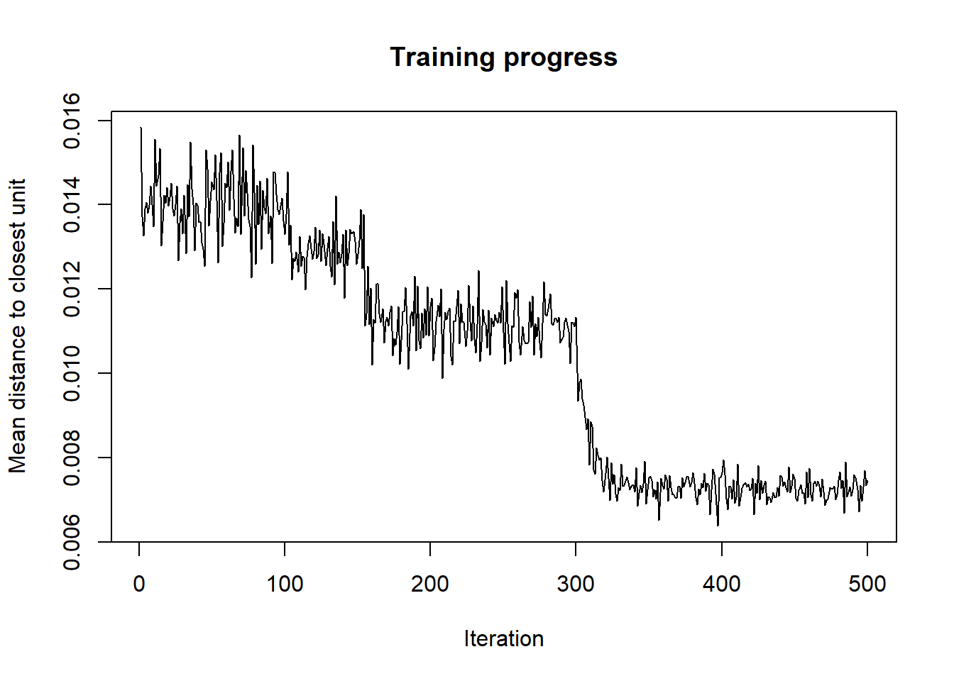
Training Progress
As the SOM training iterations progress, the distance from each node’s weights to the samples represented by that node is reduced. Ideally, this distance should reach a minimum of plateau. This plot option shows progress over time. If the curve is continually decreasing, more iterations are required.5
plot(ads.model, type = "changes")
Node Counts
The Kohonen package allows us to visualize the count of how many samples are mapped to each node on the map. This metric can be used as a measure of map quality–ideally, the sample distribution is relatively uniform. Large values in some map areas suggest that a larger map would be beneficial. Empty nodes indicate that your map size is too big for the number of samples. Aim for at least 5-10 samples per node when choosing map size.
plot(ads.model, type = "counts")

Nodes that colored by red mean nodes that have the least number of input values, such as in the second nodes. If the color nodes are brighter indicating the nodes have a lot of input values, such as in the 31 nodes. For nodes that have gray colors, that means the nodes do not have input values at all.
Neighbours Nodes
If we want to see nodes that have the closest or farthest neighbors, we can plot a plot based on dist.neighbours. Nodes that have darker colors mean that the nodes have a closer vector input, whereas nodes that have lighter colors mean that the nodes have vector inputs that are farther apart.
plot(ads.model, type = "dist.neighbours")

Heatmaps
Heatmaps are perhaps the most important visualization possible for Self-Organising Maps. A SOM heatmap allows the visualization of the distribution of a single variable across the map. Typically, a SOM investigative process involves the creation of multiple heatmaps and then the comparison of these heatmaps to identify interesting areas on the map. It is important to remember that the individual sample positions do not move from one visualization to another, the map is simply colored by different variables.
The default Kohonen heatmap is created by using the type “heatmap”, and then providing one of the variables from the set of node weights. In this case, we visualize the average education level on the SOM.
The default Kohonen heatmap is created by using the type “heatmap”, and then providing one of the variables from the set of node weights. In this case, we visualize the average education level on the SOM.
heatmap.som <- function(model){
  for (i in 1:10) {
  plot(model, type = "property", property = getCodes(model)[,i],
        main = colnames(getCodes(model))[i])
  }
}
heatmap.som(ads.model)


From the heatmap that is formed, we can know which nodes have the characteristics of each variablewhose value is high and the value is low.
Clustering
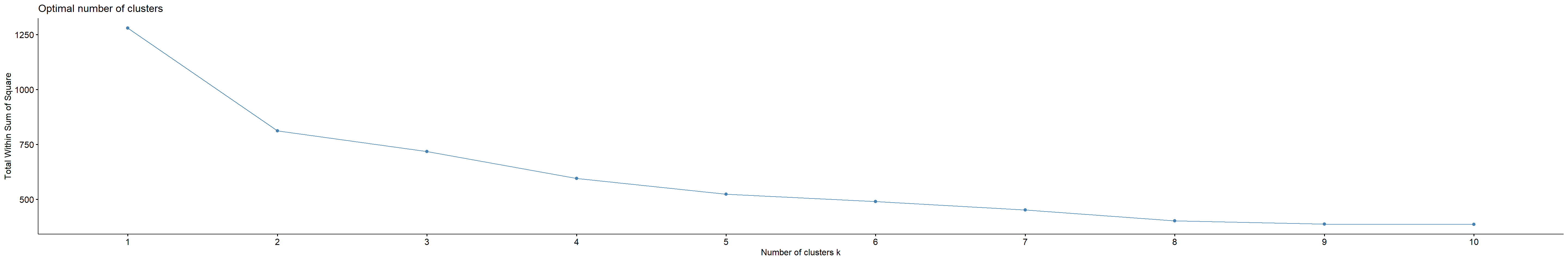
Then we want to try to clustering every observation that we have without looking at the labels of xyz_campaign_id. Like making clusters using k-means, we must determine the number of cluster that we want tomake. In this case, we want to use the elbow method to determine the number of clusters.
library(factoextra)
set.seed(100)
fviz_nbclust(ads.model$codes[[1]], kmeans, method = "wss")
set.seed(100)
clust <- kmeans(ads.model$codes[[1]], 6)

# clustering using hierarchial
# cluster.som <- cutree(hclust(dist(ads.model$codes[[1]])), 6)
plot(ads.model, type = "codes", bgcol = rainbow(9)[clust$cluster], main = "Cluster Map")
add.cluster.boundaries(ads.model, clust$cluster)

At this part, to do the profiling of the clusters that we made, we do not need to look at the descriptive results of the cluster or look deeper into the data, we only need to look at the cluster map above.
The characteristics for each cluster :
- Cluster 1 (red) : gender Male, age 30-34
- Cluster 2 (orange) : gender Female, gender Male, age 40-44, interest middle
- Cluster 3 (green light) : gender Female, gender Male, age 45-49, interest high, impression middle, clicks middle
- Cluster 4 (green) : interest high, impression high, clicks high, spent high, gender Male, age 30-34, total conversion high, approved conversion high
- Cluster 5 (turqois) : gender Male, age 45-49, interest high, clicks and spent low
- Cluster 6 (blue) : gender Female, age 45-49, interest, impression, clicks, spent, total_conversion low.
# know cluster each data
ads.cluster <- data.frame(ads.s, cluster = clust$cluster[ads.model$unit.classif])
tail(ads.cluster, 10)
#>      xyz_campaign_id interest Impressions Clicks  Spent Total_Conversion
#> 1134            1178      104      558666    110 162.64               14
#> 1135            1178      105     1118200    235 333.75               11
#> 1136            1178      106      107100     23  33.71                1
#> 1137            1178      107      877769    160 232.59               13
#> 1138            1178      108      212508     33  47.69                4
#> 1139            1178      109     1129773    252 358.19               13
#> 1140            1178      110      637549    120 173.88                3
#> 1141            1178      111      151531     28  40.29                2
#> 1142            1178      113      790253    135 198.71                8
#> 1143            1178      114      513161    114 165.61                5
#>      Approved_Conversion genderM age2 age3 age4 cluster
#> 1134                   5       0    0    0    1       5
#> 1135                   4       0    0    0    1       4
#> 1136                   0       0    0    0    1       5
#> 1137                   4       0    0    0    1       4
#> 1138                   1       0    0    0    1       5
#> 1139                   2       0    0    0    1       4
#> 1140                   0       0    0    0    1       5
#> 1141                   0       0    0    0    1       5
#> 1142                   2       0    0    0    1       5
#> 1143                   2       0    0    0    1       5
Supervised SOM
In supervised SOM, we want to classify our SOM model with our dependent variable (xyz_campaign_id). In classification case, we have to do split train-test data in order to ensure our model is good enough to predict other data pattern. First, we split our data to train-test and do a scaling step to make the range of data same.
# split data
set.seed(100)
int <- sample(nrow(ads.s), nrow(ads.s)*0.8)
train <- ads.s[int,]
test <- ads.s[-int,]

# scaling data
trainX <- scale(train[,-1])
testX <- scale(test[,-1], center = attr(trainX, "scaled:center"))
After we have done in train-test split, we make a label for our target variable.
# make label
train.label <- factor(train[,1])
test.label <- factor(test[,1])
test[,1] <- 916
testXY <- list(independent = testX, dependent = test.label)
Classification
To make an classification model implementing SOM algorithm, we can use xyf() function.
# classification & predict
set.seed(100)
class <- xyf(trainX, classvec2classmat(train.label), ads.grid, rlen = 500)
We can plot the classification result by the type change.
plot(class, type = "changes")
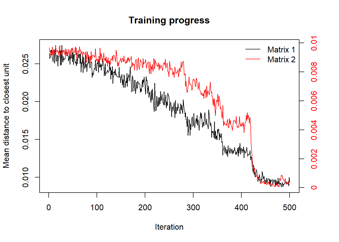
Matrix 1 shows iteration of training progress of real data and the Matrix 2 shows iteration of training progress in predict data.
Predict
To make sure our model is fit enough, we predict our test data testXY using class model. We got the confusion matrix of the prediction. In this data, we get 100% accuracy to predict each class.
pred <- predict(class, newdata = testXY)
table(Predict = pred$predictions[[2]], Actual = test.label)
#>        Actual
#> Predict 916 936 1178
#>    916   14   0    0
#>    936    0 101    0
#>    1178   0   0  114
Cluster Boundaries
We can visualize each class by each cluster using cluster boundaries.
plot(ads.model, type = "codes", bgcol = rainbow(9)[clust$cluster], main = "Cluster SOM")
add.cluster.boundaries(ads.model, clust$cluster)

To ensure our classification prediction and each cluster, we can see the visualization of each class and each cluster using cluster bounderies.
c.class <- kmeans(class$codes[[2]], 3)
par(mfrow = c(1,2))
plot(class, type = "codes", main = c("Unsupervised SOM", "Supervised SOM"),
     bgcol = rainbow(3)[c.class$cluster])
add.cluster.boundaries(class, c.class$cluster)

Conclusion
- From the results of SOM clustering using unsupervised and supervised, we can conclude that for
xyz_campaign_id916 more interested in the ads displayed are Male and Female aged 30-49 and they are interested in existing ads and then make payments after seeing the ads. - For
xyz_campaign_id936, those who see the ads is Male and Female in ranging age from 30-39 and they are only interested in the ads that are displayed but to make payments after seeing the ads are small. - For
xyz_campaign_id1178, which saw moreads for femalesand aged 30-34 years.
There are pros and cons using this algorithm. The advantage using SOM :
- Intuitive method to develop profilling
- Easy to explain the result with the maps
- Can visualize high-dimensional data by two-dimensional maps
The disadvantage using SOM :
- Requires clean, numeric data
 More details
 More details
Share this post
Twitter
Facebook
LinkedIn